
Did you know that warm colors like reds, yellows and oranges tend to make a room feel more cozy and bring objects closer in? On the other hand, cooler colors like blues, greens and violets give the eye the perception of space and openness in a room. You can make the best use of colors that create space in the home in areas that may need some enhancing.
Neutrals are the great equalizers in interior design. They are generally pleasing to the eye and require little if any effort to decorate around. Neutral colors include all grays, black, white and brown plus lighter and darker versions of each (think tan, taupe, pebble, beige, ecru – you get the picture). Neutral paint colors can also have an undertone of actual color too. It is not unusual to find a yellow-based tan, a green-based taupe or a bluish black. Should this occur, it is important to find home accents, accessories and furnishings that can accommodate that undertone.
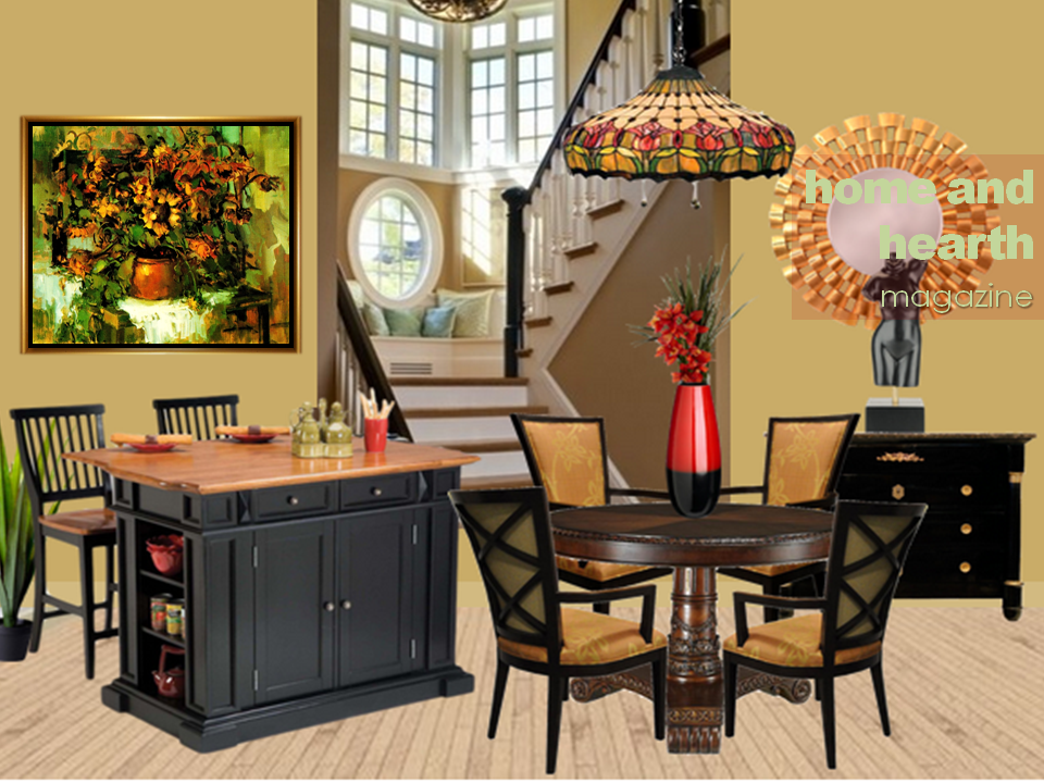
Today’s interior design interpretation features safe neutrals like taupe, white and black. However, the taupe has an undertone of green which is one of the cooler colors that can create space in the home. You’ll also notice that the tonal flow of the rendering runs up and through the stairwell that leads to a comfortable landing painted white. The window seat is bathed in natural light as it overlooks the Laguna Beach landscape.
For an element of pop interest, I’ve added focal red home decor and accessories that draw your attention in like the red drinking cup, table vase and red tulip motif in the pendant lamp hanging above the dining table.
The featured Vincent Farrell painting entitled “Sunflowers” has been added to provide interest and perspective in the rendering. One of the most interesting things about “Sunflowers” is how the application of vivid color artfully plays with light and shadows. The use of warm yellow-oranges and orange-red tones is combined with intense greens that pulse against the neutral white table cloth in the painting. It is as if shades and shadows within the picture reach out to the viewer while others elements recede. Such is the technique of chiaroscuro which Vincent Farrell so brilliantly used in this piece entitled “Sunflowers.” This is one of the paintings that has been in limited viewership so please enjoy this special presentation. For a closer look at “Sunflowers” by Vincent Farrell, please click the image above.


Related articles
- Using Color in Your Home Interior: Gray (sandiegodesign.wordpress.com)
- Choosing Color for Your Walls (homease.wordpress.com)
- Geometry in Interior Design (summerbills.wordpress.com)

The giltwood mirror gets my vote.
It’s one of my faves too. You’ve got great taste Modmissy.
I love the Sunflower Painting. I also love Laguna Beach, such a beautify place.
So glad you stopped by. Thanks for sharing your comments.
Wow! This is not only a great use of colors and furniture/accent choices, the space itself is wonderful. Interesting stairway, nice window seat, gorgeous use of light and design in the windows and that molding around the ceiling! Wherever did you find such an amazing piece of architecture? I love the juxtaposition of the coziness of the room with the openness of the stairway. Nice job!!
Kay in Hawaii
Hi Kay,
Thanks for your glowing feedback. I enjoy the creative process and I guess it shows. Enjoy your day. Best, Home and Hearth Magazine Online
This confirms that I have MUCH to learn about color and design. I’d better come back. Often.